Wednesday, May 13, 2015

Assignment 6 - Dissimilarity Index and Multiple Regression

Part I – Dissimilarity Index

White compared to Black:
∑ |a-b| = 90.56
DI = 45.28 – meaning 45.28% of black people would have to move in order to have an equal distribution of white people and black people.

White compared to Asian:
∑ |a-b| = 78.93
DI = 39.46 – meaning 39.46% of Asians would have to move in order to have an equal distribution of white people and Asians.

White compared to Hispanic:
∑ |a-b| = 77.45

DI = 38.73 – meaning 45.28% of Hispanics would have to move in order to have an equal distribution of white people and Hispanics.

Map of Dune County with the percentage of minorities by census tract.
These results show that around 40% of the population would have to move in order to have an even distribution of the races in each census tract. The maps show that Non-Whites are by far concentrated in the central parts of Madison and Dane County. Non-whites would have to move out into the suburbs of Madison and the surround small towns in Dane County in order to have an equal distribution of Whites and Non-whites.

Part II – Kitchen Sink


SPSS results of a Kitchen Sink Approach.
Hypotheses

The Null Hypothesis is that there is no linear relationship between Number of Foreclosures per 100 persons and High Cost Loans. The Alternative Hypothesis is that there is a linear relationship between Number of Foreclosures per 100 persons and High Cost Loans.

The Null Hypothesis is that there is no linear relationship between Number of Foreclosures per 100 persons and Percent of people with Mortgages. The Alternative Hypothesis is that there is a linear relationship between Number of Foreclosures per 100 persons and Percent of people with Mortgages.

The Null Hypothesis is that there is no linear relationship between Number of Foreclosures per 100 persons and Percent of Black people. The Alternative Hypothesis is that there is a linear relationship between Number of Foreclosures per 100 persons and Percent of Black people.

The Null Hypothesis is that there is no linear relationship between Number of Foreclosures per 100 persons and Percent of White people. The Alternative Hypothesis is that there is a linear relationship between Number of Foreclosures per 100 persons and Percent of White people.

The Null Hypothesis is that there is no linear relationship between Number of Foreclosures per 100 persons and Percent of Non-white people. The Alternative Hypothesis is that there is a linear relationship between Number of Foreclosures per 100 persons and Percent of Non-white people.

The Null Hypothesis is that there is no linear relationship between Number of Foreclosures per 100 persons and Percent of Asian people. The Alternative Hypothesis is that there is a linear relationship between Number of Foreclosures per 100 persons and Percent of Asian people.

The Null Hypothesis is that there is no linear relationship between Number of Foreclosures per 100 persons and Unemployment. The Alternative Hypothesis is that there is a linear relationship between Number of Foreclosures per 100 persons and Unemployment.

The Null Hypothesis is that there is no linear relationship between Number of Foreclosures per 100 persons and Commuting Minutes. The Alternative Hypothesis is that there is a linear relationship between Number of Foreclosures per 100 persons and Commuting Minutes.
The most significant variables were HighCostLoans and PerMortgage10. I know this because of their low significance values which were close to 0; no other variables had significance values under the required 0.05. They also had positive betas which show that they increase as the dependent variable increase.
At first there was some multicollinearity because of the variable PerBlack. I knew this because of the Eigen value that were close to zero and the condition indexes that were over 30. Once I had removed this variable the multicollinearity disappeared.
PerNonwhite was exclude right away meaning that the variable was just so far from significant the regression didn’t include it. I then removed the remaining variables that were not found significant which included PerWhite, ComMins10 and Unemploy10, PerAsian. I had to rerun the statistics five times in order to get my final equation by removing the least significant variable each time until there were only significant variables left.
At first the significance value was 0.090 for PerMortgage10 but by the time that I had eliminated all other variables beside PerMortgage10 and HighCostLoans the significance value had gone down to 0.017 which is below the 0.05 needed to be significant.

For Number of Foreclosures per 100 persons and High Cost Loans I reject the null hypothesis. There is a linear relationship between the two.

For Number of Foreclosures per 100 persons and Percentage of people with mortgages I reject the null hypothesis. There is a linear relationship between the two.

For Number of Foreclosures per 100 persons and Percent of Black people I fail to reject the null hypothesis. There is no linear relationship between the two.

For Number of Foreclosures per 100 persons and Percent of White people I fail to reject the null hypothesis. There is no linear relationship between the two.

For Number of Foreclosures per 100 persons and Percent of Non-white people I fail to reject the null hypothesis. There is no linear relationship between the two.

For Number of Foreclosures per 100 persons and Percent of Asian people I fail to reject the null hypothesis. There is no linear relationship between the two.

For Number of Foreclosures per 100 persons and Unemployment I fail to reject the null hypothesis. There is no linear relationship between the two.


For Number of Foreclosures per 100 persons and Commuting Minutes I fail to reject the null hypothesis. There is no linear relationship between the two.

My final equation is y = -0.10 + 0.004x1 + 0.004x2

The variables are
y = Number of Foreclosures per 100 persons (Count2011)
x1 = High Cost Loans (HighCostLoans)
x2 = Percent of people with mortgages (PerMortgage10)

My results show that high cost loans and percent of people with mortgages have significant correlations with the number of foreclosures per 100 persons. I can use this equation to predict the number of foreclosures per 100 persons in a given census tract if I have the data for high cost loans and percent of people with mortgages.

Part III – Stepwise


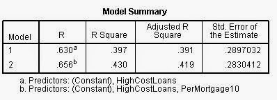
SPSS results from a Stepwise Regression.
I ended up with the same model as the Kitchen Sink Approach:

Final equation is y = -0.10 + 0.004x1 + 0.004x2

The variables are
y = Number of Foreclosures per 100 persons (Count2011)
x1 = High Cost Loans (HighCostLoans)
x2 = Percent of people with mortgages (PerMortgage10)

The Stepwise Regression gives me the same model and equation as the Kitchen Sink Approach, however it does it in one step instead of multiple. That’s awesome that the stepwise approach can do all of that analysis by itself; it saves time in having to rerun the regression over and over until I get an equation.

Prediction:

x1 = 80.0 High Cost Loans
x2 = 50.0% Drive to Work

y = -0.10 + 0.004(80.0) + 0.004(50.0)

y = -0.10 + 0.32 + 0.20

y = 0.42

According to my model, having 80 high cost loans and 50% of people driving to work in a given census tract you will get 0.42 foreclosures per 100 persons in that census tract.

I am somewhat confident in my results due to the okay R2 value of 0.430 that I had in my model. The high significance that the two variables I used helps the confidence that I have in the model, but the R2 value is the most important sign of the strength of a model. So, I would say that my model is moderately adequate.

Tuesday, April 28, 2015

Assignment 5 - Regression Analysis

Part I

Regression Analysis of Crime Rate and Free Lunches (fig. 1)
Crime rate is the dependent value and free lunches is the independent value. The null hypothesis is that there is not a linear relationship between free lunches and crime rate in the given areas. The alternative hypothesis is that there is a linear relationship between free lunches and crime rate in the given areas. We fail to reject the null hypothesis because there is a small relationship between free lunches and crime rate since the confidence value is under .05. The regression equation is y=1.685x+21.819. The percentage of persons getting a free lunch with a crime rate of 79.7 would be 34.35% according to this model. I am not very confident in this result due to the model's weak correlation and the r-squared value is low.

Part II

Introduction

For this next exercise we are to look at data from the UW system and find which variables best describe why students choose the school they do based on what county they are from. Some of the variables we will be looking at include number of people within the county that have some college, 2 years of college, college degree, graduate/professional degree, population, population 18-24, median household income. The focus will be on two specific schools that I picked, UW-Eau Claire and UW-Madison and focusing on the variables of percentage BS degree, median household income, and population normalized by distance from school. We will exclude any students that come from out-of-state in this analysis.

Methods

The first thing to do is to perform regression analysis on each of the three variables for both schools. For each regession analysis output we can tell if the variable is significant if the significant value is below .05. First I state the null and alternative hypotheses for both schools for each of the three variables.

Eau Claire student attendance and Population normalized by distance for Eau Claire.
  • The null hypothesis is that there is no significant relationship between Eau Claire student attendance and Population normalized by distance for Eau Claire. The alternative hypothesis is that there is a significant relationship between Eau Claire student attendance and Population normalized by distance for Eau Claire.
Regression Analysis of Eau Claire student attendance and Population normalized by distance from Eau Claire which is showing that there is a significant relationship because of the low significance value of .000 which is under the critical value. (fig. 2)
We reject the null hypothesis for the variable of population normalized by distance from Eau Claire because the regression analysis shows a value below the critical value.

Eau Claire student attendance and percentage of BS degrees.
  • The null hypothesis is that there is no significant relationship between Eau Claire student attendance and percentage of BS degrees. The alternative hypothesis is that there is a significant relationship between Eau Claire student attendance and percentage of BS degrees.
Regression Analysis of Eau Claire student attendance and percentage of BS degrees which is showing that there is a significant relationship because of the low significance value of .003 which is under the critical value. (fig. 3)
We reject the null hypothesis for the variable of percentage of BS degrees because the regression analysis shows a value below the critical value.

Eau Claire student attendance and median household income.
  • The null hypothesis is that there is no significant relationship between Eau Claire student attendance and median household income. The alternative hypothesis is that there is a significant relationship between Eau Claire student attendance and median household income.
Regression Analysis of Eau Claire student attendance and median household income which is showing that there is no significant relationship due to the high significance value of 0.104 which is above the critical value. (fig. 4)
We fail to reject the null hypothesis for the variable of mean household income because the regression analysis shows a value above the critical value.

Madison student attendance and Population normalized by distance for Madison. 
  • The null hypothesis is that there is no significant relationship between Madison student attendance and Population normalized by distance for Madison. The alternative hypothesis is that there is a significant relationship between Madison student attendance and Population normalized by distance for Madison.
Regression Analysis of Madison student attendance and Population normalized by distance from Madison which is showing that there is a significant relationship because of the low significance value of .000 which is under the critical value. (fig. 5)
We reject the null hypothesis for the variable of population normalized by distance from Madison because the regression analysis shows a value below the critical value.

Madison student attendance and percentage of BS degrees.
  • The null hypothesis is that there is no significant relationship between Madison student attendance and percentage of BS degrees. The alternative hypothesis is that there is a significant relationship between Madison student attendance and percentage of BS degrees.
Regression Analysis of Madison student attendance and percentage of BS degrees which is showing that there is a significant relationship because of the low significance value of .000 which is under the critical value. (fig. 6)
We reject the null hypothesis for the variable of percentage of BS degrees because the regression analysis shows a value below the critical value.

Madison student attendance and median household income.
  • The null hypothesis is that there is no significant relationship between Madison student attendance and median household income. The alternative hypothesis is that there is a significant relationship between Madison student attendance and median household income.
Regression Analysis of Madison student attendance and median household income which is showing that there is a significant relationship due to the low significance value of 0.001 which is below the critical value. (fig. 7)
We reject the null hypothesis for the variable of median household income because the regression analysis shows a value below the critical value.

Results

I will map the residuals for just those variables that were found to be significant and the above regression analyses show that all but one of the variables was found to be significant. To get the residuals I just needed to save the standardized residuals before performing the regression analysis and export the tables of residuals to ArcGIS.

Eau Claire student attendance and Population normalized by distance for Eau Claire. R2=.753
This variable had a significance value of .000 and shows a pattern of counties with large population centers having large attendance at UW-Eau Claire. (fig. 8)
Eau Claire student attendance and percentage of BS degrees. R2=.121
This variable had a significance value of .003 and shows a pattern that counties with high percentages of BS degrees have large attendance at UW-Eau Claire. (fig. 9)
Madison student attendance and Population normalized by distance for Madison. R2=.853
This variable had a significance value of .000 and shows a pattern of the largely populated Milwaukee area as having large attendance at UW-Madison. (fig. 10)
Madison student attendance and percentage of BS degrees. R2=.154
This variable had a significance value of .000 and shows a pattern that counties with high percentages of BS degrees have large attendance at UW-Madison. (fig. 11)
Madison student attendance and median household income. R2=.363
This variable had a significance value of .001 and shows a pattern of counties that have high median household income such as the Milwaukee and Madison areas have high attendance at UW-Madison. (fig. 12)

Discussion & Conclusion

The results from the residuals for Eau Claire show that the two variables of population normalized by distance to Eau Claire and percentage of BS degrees have a correlation with the students that attend UW-Eau Claire in each county. This means that students that go to UW-Eau Claire are more likely to come from populated areas and areas that have a lot of people with BS degrees. UW-Eau Claire students likely come from populated and educated areas across the state. Median household income does not have a significant relationship with student attendance at UW-Eau Claire meaning that income does not significantly influence students to attend UW-Eau Claire. The R2 value for the percentage of BS degrees is low however and this means that the BS degree variable has a weak relationship with student attendance at UW-Eau Claire. The population normalized by distance to Eau Claire variable has a high R2 and a very strong relationship with student attendance at UW-Eau Claire meaning this is the most influential predictor I looked at for why students choose to go to UW-Eau Claire.

The results from the residuals for Madison shows that all three of the variables of population normalized by distance to Eau Claire, percentage of BS degrees and median household income all have a correlation with the students that attend UW-Madison in each county. This means that students that go to UW-Madison are more likely to come from populated areas, areas that have a lot of people with BS degrees and areas with high median household income. UW-Madison students likely come from populated, educated and rich areas across the state. The R2 value for percentage of BS degrees and median household income have low R2 values meaning that they have weak relationships with student attendance at UW-Madison. The population normalized by distance to Madison variable has a very high R2 and a very strong relationship with student attendance at UW-Madison meaning this is the most influential predictor I looked at for why students choose to go to UW-Madison.

Tuesday, April 7, 2015

Assignment 4 - Correlation & Spatial Autocorrelation

Part 1: Correlation

Scatter-plot Results with Trend-line
Pearson Correlation Results in SPSS
1. The null hypothesis is that there is no relationship between distance and sound level. The alternative hypothesis is that there is a relationship between distance and sound level. This Pearson Correlation shows a strong negative correlation between distance and sound level. Therefore we will reject the null hypothesis.

Results of Correlation Matrix in SPSS

2. This matrix tells me certain strong correlations between variables. Some examples include: Percent Black has a very strong negative correlation with Bachelors Degree and a strong positive correlation with Below Poverty while Percent Hispanic has a very strong positive correlation with no high school Diplomas. There seems to be a pattern in non-white percentages that don't have high school diplomas or bachelor degrees, walk to work and are below the poverty level. Meanwhile white percentages are less likely to walk to work, be under the poverty level and to not have a high school diploma and/or bachelors degree. 

Part 2: Spatial Autocorrelation

Introduction

This exercise will be looking a 1980 and 2008 Presidential Elections in Texas and looking for patterns in the voting for the Texas Election Commission (TEC). We will comparing the results to Hispanic Population as well to see if there is a relationship between the that and voting turnouts. The TEC wants to see if there is clustering in voting patterns in the state as well as if there as been a change in the past 30 years.

Methods

The first process to this is to download the information I need to analysis this data. I downloaded the Hispanic 2010 Population Percentage for the counties of Texas from the U.S. Census website. The Voting data was provided by the TEC. I downloaded a shapefile of the counties in Texas also on the U.S. Census website. Next, in ArcGIS I performed a join between the Texas counties shapefile and the 2010 Census data as well as the voting data provided by TEC until I had all three datasets in one shapefile. To create the shapefile after I joined these tables to the counties I simply export the data into a shapefile.

Once I have my shapefile I can open it in GeoDa to perform some spatial auto-correlation analysis. First, I need to create a .gal file from the shapefile by going to Tools--Weights--Create and clicking on Add ID Variable, selecting Poly-ID and Rook Continuity under contiguity weight. Make sure to save the file as a .gal file. This will be used in the analysis later.

The first analysis we are going to do is a Moran's I. To do this just click on the Univariate Moran button, select the variable you want to analyze and select the .gal file created before. I repeated this for all five variables. Next, to create a LISA Cluster Map you just need to click the Univariate LISA, select the variable, select the .gal file from earlier and check The Cluster Map. Below I have all of the Moran's I and LISA Cluster Maps for each of the five variables.

Results


Moran's I and LISA Cluster Map for the Voter Turnout 1980 variable
The voter turnout in 1980 had some large clustering going on. The northern counties had a cluster of very high voter turnout while the southern and eastern counties had clustering of low voter turnout. The variable has a medium strong positive correlation.


Moran's I and LISA Cluster Map for the Percent Democratic Vote 1980 variable
The percentage of democratic votes in 1980 has even larger clustering going on. The northwestern counties have clusters of low democratic votes while the southern and eastern countries have clusters of high democratic votes. There is a medium strong positive correlation to this variable.

Moran's I and LISA Cluster Map for the Voter Turnout 2008 variable
Voter turnout in 2008 has small clustering in the counties of Texas. There are clusters of high voter turnout in the northern, northeastern and central counties as well as a cluster of low voter turnout in the southern counties. This variable has a medium strong positive correlation.

Moran's I and LISA Cluster Map for the Percent Democratic Vote 2008 variable
The percent of democratic votes in Texas in 2008 has large clusters going on. There are clusters of low percentage of democratic votes in the northern, northwestern and central counties while there are clusters of high democratic votes in the southern and southwestern counties. This variable has a very strong positive correlation.

Moran's I and LISA Cluster Map for the Percent Hispanic Population variable
The percentage of Hispanic population in 2010 in Texas has very large clusters going on. There is a large cluster of low percentage of Hispanic population in the northeastern counties while there is large cluster of high percentage of Hispanic population in the southwestern counties. This variable has a very strong positive correlation.

Conclusion

There are patterns in the voting in Texas counties between 1980 and 2008 as well as in Hispanic Populations in 2010. In 1980 there is a pattern of high voter turnout for Republicans in the north and low voter turnout for Democrats in the south and east. In 2008 there is a similar pattern however the Democrats have moved from the east to the west with low voter turnout still occurring in the southern counties. A variable that could be affecting the Democratic vote from moving east to west could be the increase in Hispanic population in the west counties and the lack of Hispanic population in the eastern counties.

For the analysis for the TEC I would tell them that there is a clustering in the state voting patterns with Democrats in the south and Republicans in the north. There has been a change in voting patterns over the last 30 years; the Democratic vote has moved from the east to the west and it seems to be possibly related to the Hispanic population in the western counties.

Friday, March 13, 2015

Assignment 3 - Z-tests and T-tests

Part I

1. Fill in the chart:

Interval Type
Confidence Level
N
a
Z or t?
Z or t value
A
2
90
45
0.05
Z
+/- 1.64
B
2
95
12
0.025
T
+/- 2.179
C
1
95
36
0.05
Z
1.64
D
2
99
180
0.005
Z
+/- 2.57
E
1
80
60
0.2
Z
0.84
F
1
99
23
0.01
T
2.5
G
2
99
15
0.005
T
+/- 2.947

2. The null hypothesis is that there is no significant difference between the sample mean and the estimated mean. The alternative hypothesis is that there is a significant difference between the sample mean and the estimated mean. I performed a z-test for each of them because the sample size was larger than 30. I had a 95% confidence level and a 2-tailed model giving me a level of significance of 0.025. For each of the invasive species the conclusion was the same: we reject the null hypothesis. The z-test had to stay within -1.96 and +1.96 and for each of the three they were all outside the range. From these conclusions I can ascertain that the Asian-Long Horned Beetle is not found in this county as much as in the rest of the state and the Emerald Ash Borer Beetle and Golden Nematode are more common in Buck County than the rest of the state.


z-test score
Asian-Long Horned Beetle
-7.749
Emerald Ash Borer Beetle
9.247
Golden Nematode
2.477

3. The null hypothesis is that the number of people per party has not changed in the intervening years between 1960 and 1985. The alternative hypothesis is that the number of people per party has changed in the intervening years between 1960 and 1985. I used a t-test since the sample size was smaller than 30. I had a 95% confidence level and a one-tailed test giving me a level of significance of 0.05. The conclusion was: We can reject the null hypothesis. The test had to stay below 1.708 and the t-test score was 4.924. The corresponding probability value that the null hypothesis is true is 0.000%.

Part II

Introduction

The second part of this assignment was a write-up that was based on Wisconsin research regarding the concept of "Up-North". The Tourism Board of Wisconsin wants me to find the variables that separate the "Up-North" from the bottom half of Wisconsin. Then I need to perform a chi-squared test on three variables and comparing the northern counties to the southern counties to see if those variables are what separate the north from the south.

Methods 

To achieve this I first need to download a shapefile from the U.S. Census website. I choose the counties within the state of Wisconsin and downloaded the files. To determine what counties were in the north I separated the counties between Hwy. 29. The counties above Hwy. 29 I gave a value of 1 in a newly made field and the counties below I gave a value of 2 (see figure 1).

Map showing the "Up North" counties separate from the "Down South" counties. (fig. 1)

I then joined the counties feature class to a table that included a bunch of information on Wisconsin counties including things that could be found more in "Up-North" counties. The fields that I choose to look at were deer licences, population and wilderness. For the fields of wilderness and deer licences the larger numbers were excepted in the north and for population lower numbers were excepted in the north. I ranked the counties from 1-4 for each county with hypothesized "Up-North" values with the higher numbers. The following maps show the three variables each with four rankings. (see figures 2-4).

Map of the number of deer gun licences in Wisconsin counties. (fig. 2)

Map of the population in Wisconsin populations. (fig. 3)
  
Map of the number of acres of wilderness in Wisconsin counties. (fig. 4)
I then exported the table with the fields of population, wilderness and deer gun licences included in order to analyze the chi-squared tests to see if there is a correlation with these variables and being in "Up-North". We used the program IBM SPSS Statistics 19 to do the chi-squared tests on the data. The chi-squared tests for each of the variables is shown below (see figures 5-7). I will discuss the meaning of these variables and the chi-squared test outcomes in the discussion and section.

Chi-squared test for the variable of deer gun licences. (fig. 5)
Chi-squared test for the variable of wilderness acreage. (fig. 6)
Chi-squared test for the variable of population. (fig. 7)

Results & Discussion


I chose the variable of population because I thought that less people would be living in the north. I chose the variable of deer gun licences because I thought that more people would have them in the north. Lastly, I chose the variable of wilderness because I thought that the most wilderness acreage would be in the north.

The null hypothesis is that there is no difference between the expected and observed frequencies of each variable occurring in the north; meaning that the variables are just as likely to occur in the north than south. The alternative hypothesis is that there is a different between the expected and observed frequencies of each variable occurring in the north; meaning that the variables are more likely to occur in the north than the south. For the variables of wilderness and deer gun licences we fail to reject the null hypothesis because the chi-squared test value is smaller than the CV for both of them. For the variable of population we reject the null hypothesis because the chi-squared test value is larger than the CV.

Conclusion

The maps and chi-squared tests show that the variables of deer gun licences and wilderness do not show signs that they are more frequent in the north, however they do show that there is a correlation between low population and living in the north. I do not think that the first two variables are good at explaining what it is that makes the north what it is. However, low population is a variable that could be a factor in the definition of what "Up-North" really means.

Sources:
All data provided by Prof. Weichelt. 

Thursday, February 26, 2015

Assignment 2 - Z-scores, Mean Center and Standard Disance

Introduction   

In this exercise we were asked to analyze tornado county data from Oklahoma and Kansas. We were given two sets of data, one of tornadoes from 1996-2006 and one of tornadoes from 2007-2012. We needed to see if there were patterns in the data and if there is an increase in tornado frequency between the two time periods. We are to approach this project as a independent researcher who needs to answer if these states should require more tornado shelters to be built due to increased danger. They want to make sure that it is worth the money it would take to build this shelters or if tornado frequencies are the same as they have already been.

We also need to look at where tornadoes are more likely to occur and if there is a pattern in the change between the two time periods. If there is a significant change in the occurrence and location of tornadoes between the late 1990s to early 2000s and the late 2000s to early 2010s we need to suggest weather or not we believe a new requirement for tornado shelters should be implemented.

Methods

The first part of the exercise we looked at the mean center, weighted center, standard distance and weighted standard distance. First calculate the mean center for each data set. The mean center is the average point of all the points in the data set. In other words, you take the average x-value of all the points and the average y-value and plot those x and y-values to find the point that is the mean center. To do this I chose the mean center tool under the spatial statistics toolbox and set the input to tornadoes (1996-2006). This gives me an output of a point that is the mean center for that data set. Then, repeat the process with the data set of tornadoes (2007-2012). 

Next calculate the weighted mean centers for each of the data sets. This gives the mean center a weight based on the width of the tornadoes so that large tornadoes have a larger effect on the location of the mean center. To do this select the same mean center tool from the spatial statistics toolbox. Then, set the input to tornadoes (1996-2006) and selected the weighted field to tornado width (feet). Then, repeat the process with the data set of tornadoes (2007-2012).

The maps below show the mean centers for each data set as well as weighted mean centers. Then include the tornadoes with graduated symbology based on the width of the tornadoes. The mean center and weighted mean center shows us weather or not the tornadoes have been moving and changing patterns from the first time period to the second. As you can see the mean center has moved north and the weighted mean center has moved east. This tells us that more tornadoes have been occurring in the northeastern parts of Kansas in the recent years than before.


The mean center and weighted mean center for the tornadoes data set (1996-2006) as well as the data set with graduated symbology of the tornadoes' width in feet. (figure 1)

The mean center and weighted mean center for the tornadoes data set (2007-2012) as well as the data set with graduated symbology of the tornadoes' width in feet. (figure 2)

The mean centers and weighted mean centers for both of the tornadoes data sets (1996-2006 & 2007-2012) as well as the data sets with graduated symbology of the tornadoes' width in feet. (figure 3)

The second part of the exercise had us calculate the standard distance for each set of data points. The standard distance gives us the average distance from the mean center that the points are in the specified data set. To do this we needed to use the standard distance tool in the spatial statistics toolbox. I set the input to tornadoes (1996-2006) and kept the default settings for the rest. Then repeat this for the data set of tornadoes (2007-2012). 

Below are the maps of each data set with the weighted mean center and the standard distance. This will show us the average distance from the mean center has change between the two time periods. As you can see the standard distance has shifted northeast. This shows the same results as the mean center and weighted mean center shifts in the first part and that more tornadoes are occurring in the northeastern parts of Kansas.


The standard distance and weighted mean center for the tornadoes data set (1996-2006) as well as the data set with graduated symbology of the tornadoes' width in feet. (figure 4)

The standard distance and weighted mean center for the tornadoes data set (2007-2012) as well as the data set with graduated symbology of the tornadoes' width in feet. (figure 5)

The standard distance and weighted mean center for both of the tornadoes data sets (1996-2006, 2007-2012) as well as the data sets with graduated symbology of the tornadoes' width in feet. (figure 6)

The last part was focusing on z-scores. A z-score is the specific standard deviation that a particular point has in relation to the larger data set that that point is a part of. For example we looked at three specific counties to see what their z-score was. The counties were Russell County, KS, Caddo County, OK and Alfalfa County, OK. To do this we took a feature class of the counties from each state which already had a join with the tornado data set (tornadoes 2007-2012) and gave us the number of tornadoes that fell in each state under a specified field. Below is a map of the counties based the number of standard deviations each county was in relation to all of the counties in two states. 


The standard deviation based on the number of tornadoes from each county in relation to all of the counties in both states. (figure 7)

We then need to find the mean and standard deviation of the counties based on the tornado count field in the counties feature class. To do this we simply go to classify under the symbology tab and they have the statistics for the data set. The mean is 4 and the standard deviation is 4.3. Given these values we are able to calculate the z-scores for the counties mentioned above by using the equation: 


z = (x - m) / s 
where z is the z-score, x is the given county's tornado count, m is the mean and s is the standard deviation.

Z-Scores:
Russell County, KS: 4.88
Caddo County, OK: 2.09
Alfalfa County, OK: 0.23

Given the information and the calculations that we have made from the data sets of tornadoes in Kansas and Oklahoma we are able to also find the probability of the number of tornadoes in these states. If we wanted to know what number of tornadoes could happen in any given county in both states in a given year we could simply take the probability and find the z-score associated with that probability and work backwards to find the number of tornadoes that fits that z-score. 

For example if we wanted to how many tornadoes would take place in a county in Kansas or Oklahoma 70% of the time in a given year. We would find the z-score that falls under 0.70 probability, which is -0.52. Next we would just multiply this z-score with the standard deviation and subtract the mean: (-0.52 * 4.3) + 4 = 1.764. Therefore, 70% of the time there are at least 1.7 tornadoes in any given county during any given year in Kansas and Oklahoma. 

Another instance would be to find how many tornadoes would happen 20% of the time. The z-score for 0.20 probability is 0.84. Then we calculate the number of tornadoes: (0.84 * 4.3) + 4 = 7.612. There 20% of the time there is at least 7.6 tornadoes in any given county during any given year in Kansas and Oklahoma.

Results

From the analysis on the mean centers, standard distances and z-scores of the number of tornadoes in Kansas and Oklahoma there are many patterns to be found. The shift found between the year of 1996-2006 and 2007-2012 to the northeast can be linked to the increase in the number of tornadoes in the eastern and northern parts of Kansas as well as the decrease in tornadoes in the west parts of Kansas as well as the southern and western parts of Oklahoma (as seen in figure 1, 2 and 3). The standard distance maps also conveyed this pattern of the tornadoes moving to the northeast parts of Kansas (figures 3, 4 and 5).

The map of standard deviations in counties in Kansas and Oklahoma (figure 7) shows the large amounts of tornadoes in middle Kansas and middle Oklahoma. This map shows information that the mean center and standard distance maps can not show such as the frequency of tornadoes in counties and where tornadoes mostly occur. This is much more helpful in determining whether or not to build more shelters due to increases in tornadoes.

Conclusion

The data does show a shift in tornado locations between the two time periods however I do not believe this shows a increase in tornado frequency or a change in location. The tornadoes are spread out in a random plot across the two states and do not show a pattern that they are increasing in frequency or moving to a certain area of the states. 

Another factor in the change in frequency question is the time periods that were analyzed. The first data set takes place over a decade (1996-2006) while the second data set only takes place over five years (2007-2012), therefore it is difficult to tell whether or not the tornadoes frequency is due to the change in time or just the amount of time that each data set was collected.

I would recommend to these state legislators that there is not enough evidence to require the building of more tornado shelters based on the increase of tornadoes in the two states. There is some vital information gained from this exercise and that is that those counties that are in the 1.5 standard deviation category (figure 7) should look into increases their tornado shelters because these counties are the most likely to be hit by tornadoes.